Muscle Rehab
Outcome-focused positioning and packaging for an athletic-recovery brand, engineered for instant shelf and online comprehension.
- Positioning
- Packaging
- Retail

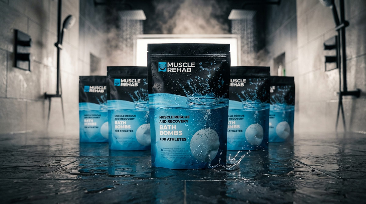
The Problem
A new athletic-recovery brand entering a crowded category had seconds to communicate what it did and why it mattered — on a shelf and in a thumbnail. The product was strong; the comprehension was not.
Role
- Outcome-led positioning
- Naming & messaging hierarchy
- Packaging system & art direction
- Retail + ecommerce comprehension
Process
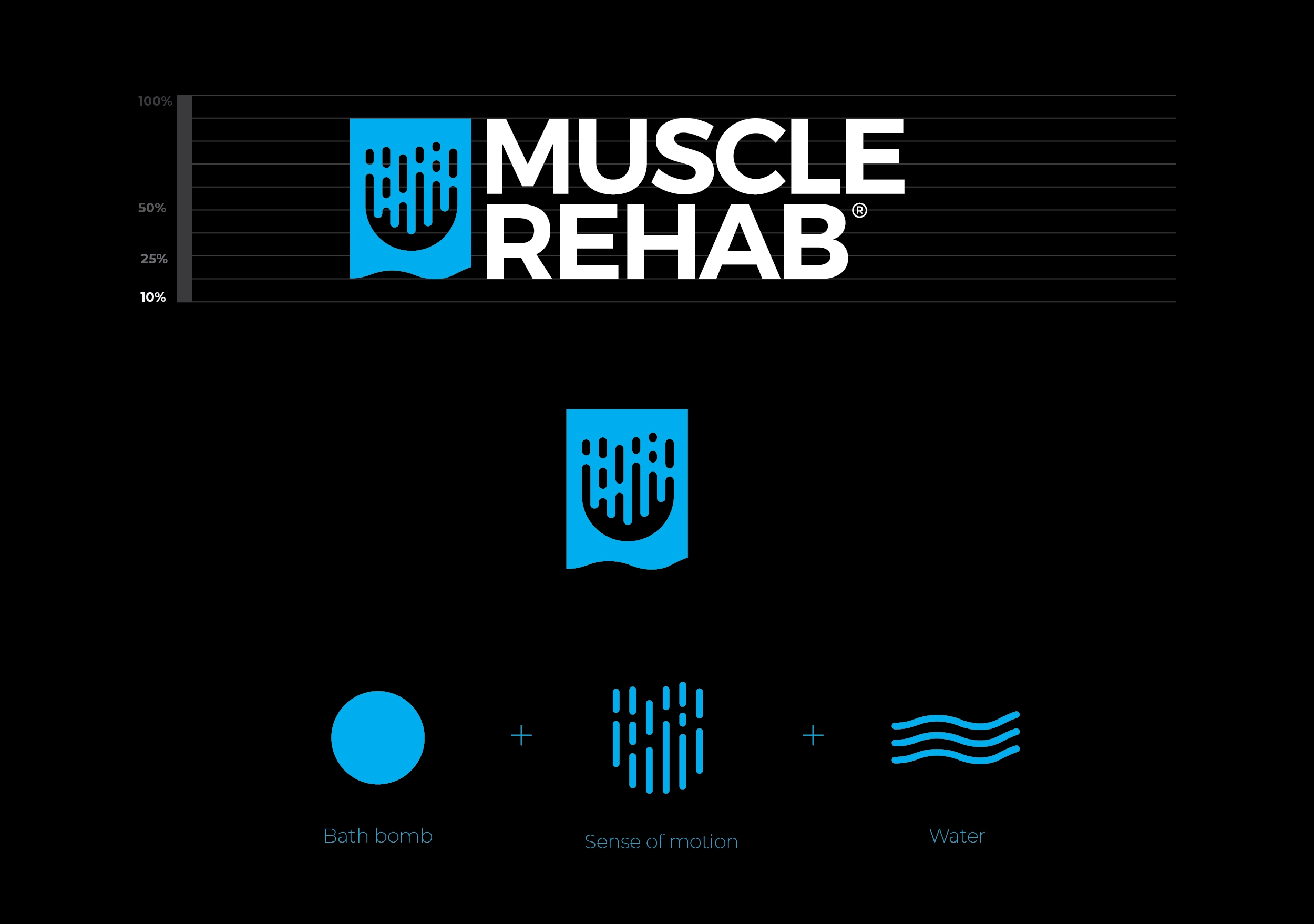
Sell the outcome, not the ingredient
We reframed the brand around the result the athlete actually wants — recovery, performance, readiness — so the value reads before the buyer ever turns the package over.
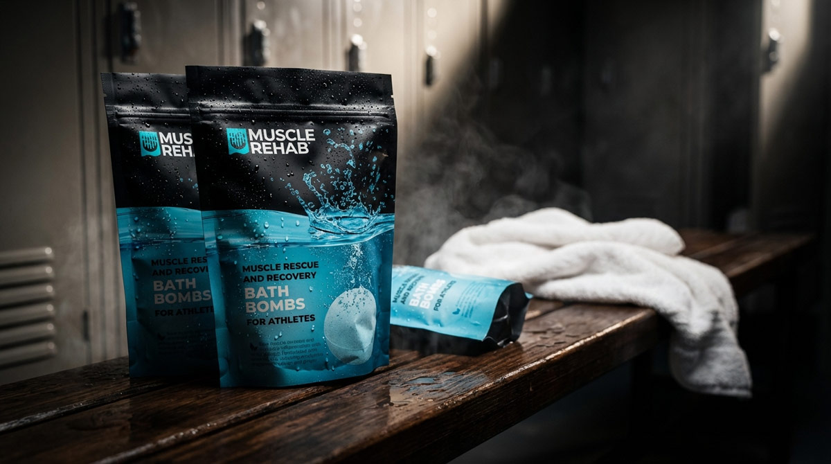
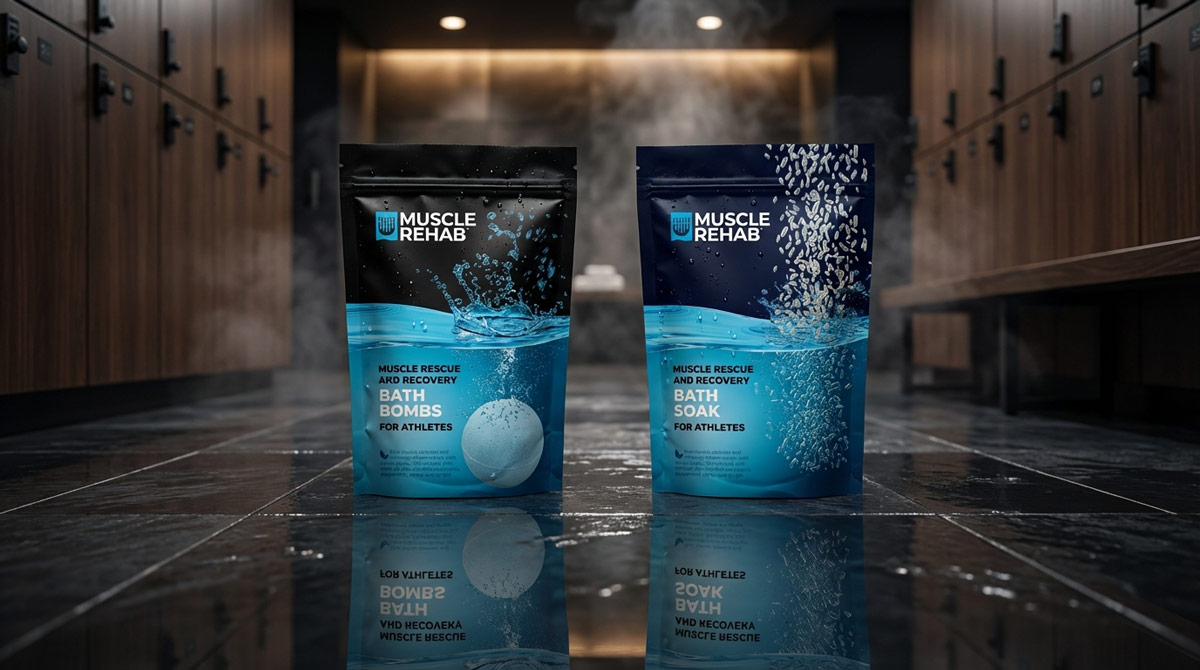
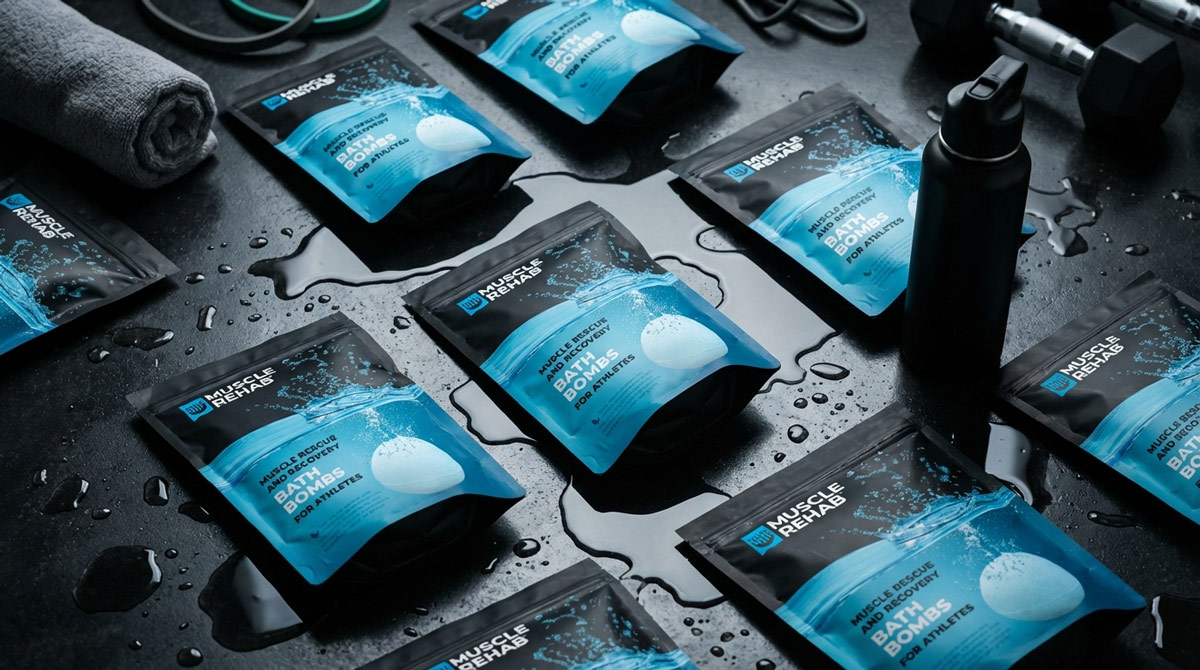
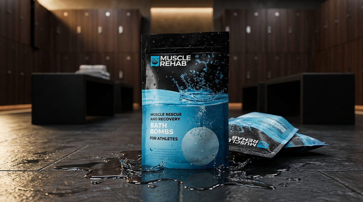
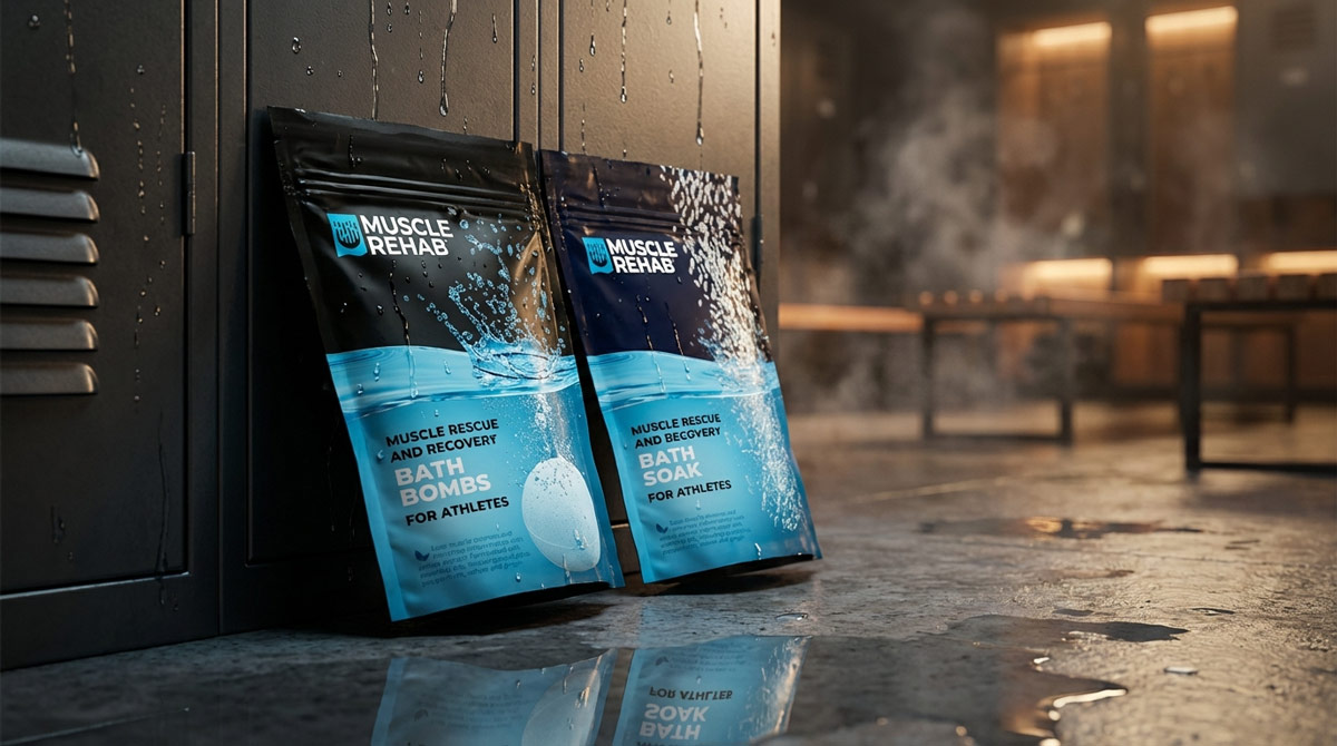
Design for the two-second glance
Packaging was built on a strict comprehension hierarchy: one dominant message, a clear product descriptor, and a system that holds up at shelf scale and at thumbnail scale alike.
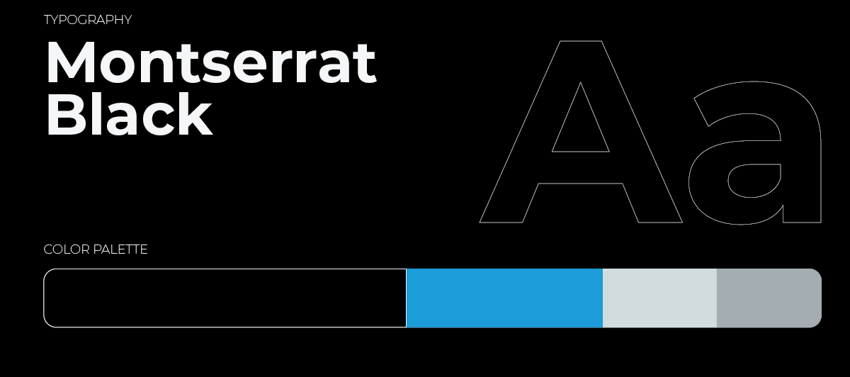
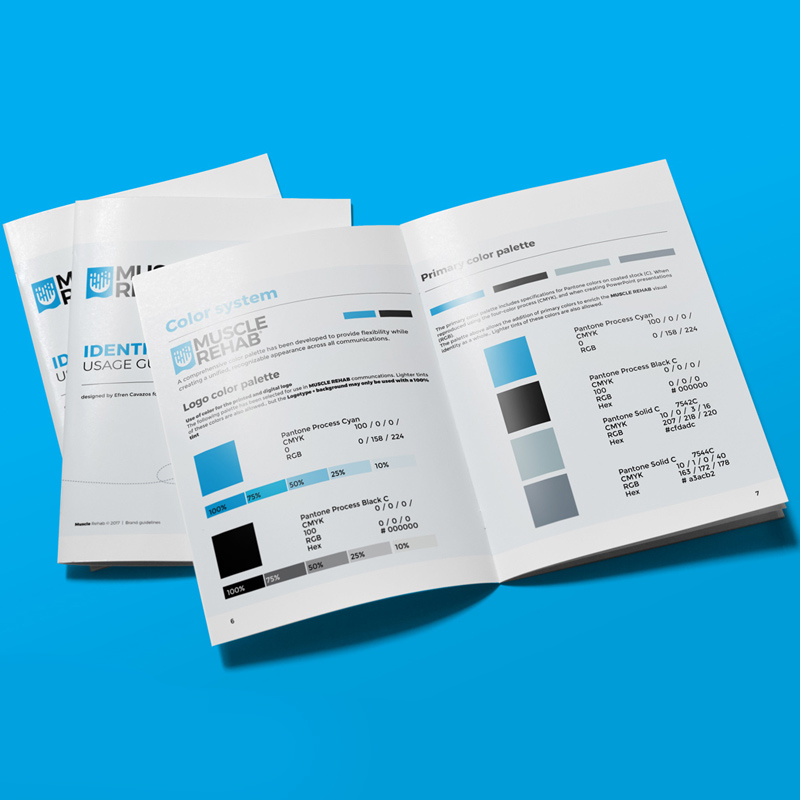
One system, every surface
The same logic carried from physical packaging to the product detail page, keeping the story consistent from aisle to cart.
Selected Frames
Outcome
Clarity became the growth lever. When buyers understood the outcome instantly, hesitation dropped and the numbers followed.