How TWHE Increased Engagement Through a Strategic Website Redesign
Applying UX strategy, messaging clarity, and mobile-first design to deliver impact in the health education sector.
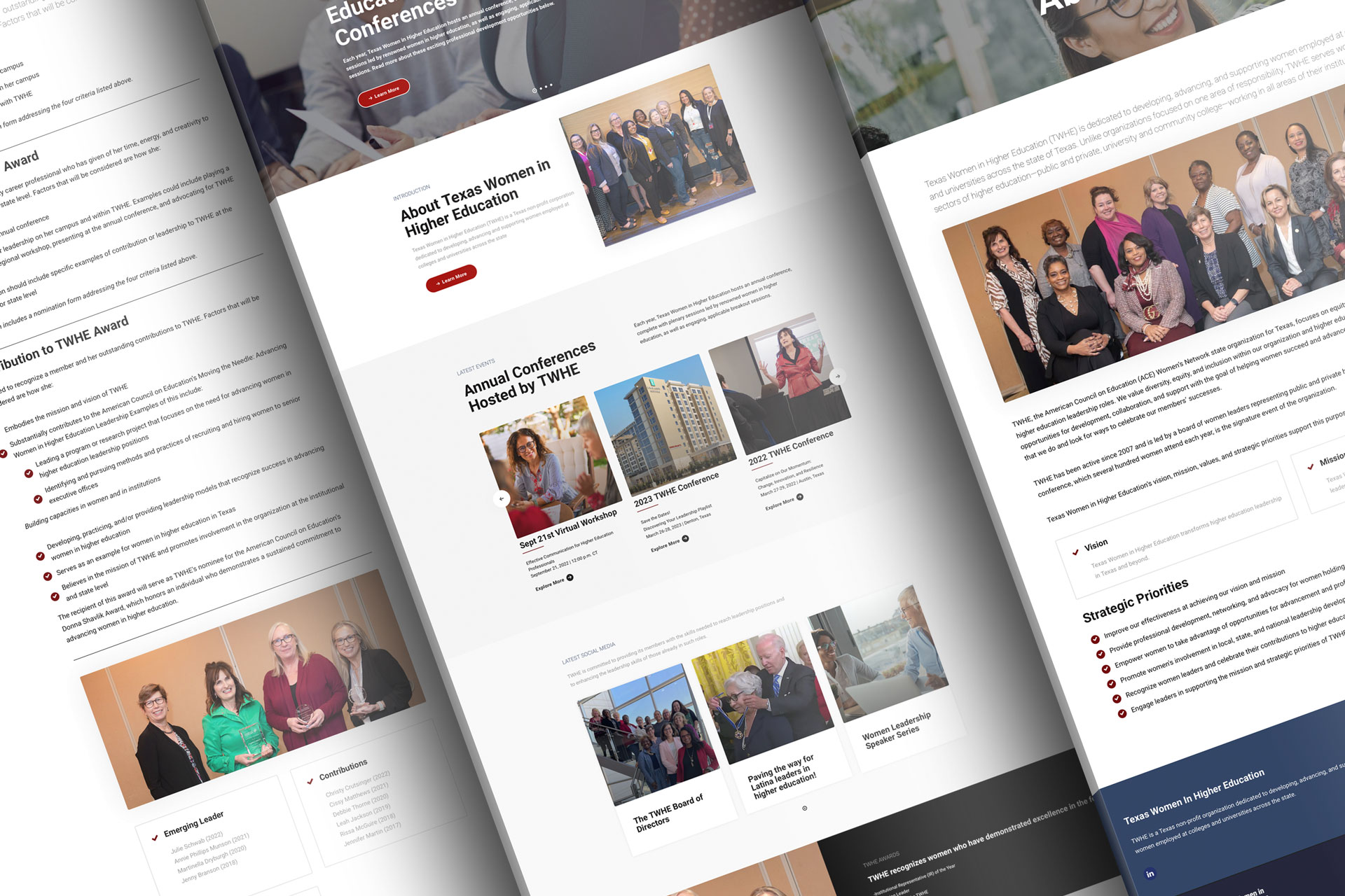
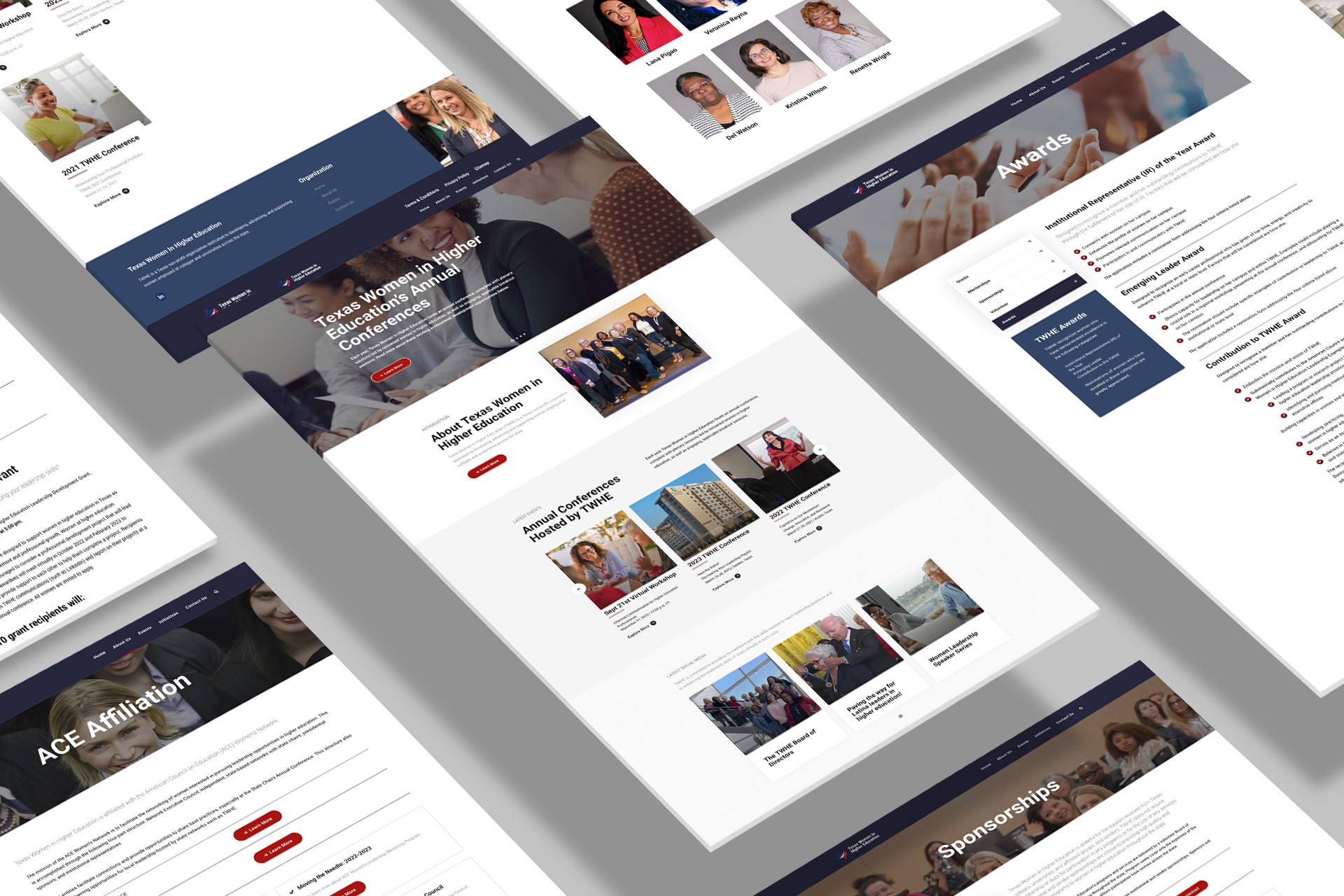
Case Study: Modernizing TWHE's Website Experience
Applying the ICON Method® to elevate storytelling, performance, and audience clarity for a more engaging brand presence.
I — Identity
Challenge: TWHE’s existing website suffered from generic content and a dated layout that failed to reflect its mission, values, and expertise in the health education space.
Goal: Create a fresh, strategic visual identity and website experience that captured TWHE’s authority, improved usability, and aligned with its evolving brand voice.
C — Communication
Strategy: Refine messaging to reflect clarity and credibility, turning information into accessible education. Copywriting and layout were restructured to drive user flow and deliver trust.
Execution: Developed user-first copy, improved site architecture, and established a visual hierarchy for easy access to services, leadership info, and calls-to-action.
O — Optimization
Design & UX: Used a mobile-first, modular layout structure with improved contrast, spacing, and CTA placements. Integrated performance tools and optimized load times across devices.
Deliverables: Full website redesign, brand-consistent visuals, responsive page templates, and keyword-aligned copy.
N — Navigation
- Reduced Bounce Rate: Visitors stayed longer due to improved clarity and content structure.
- Increased Engagement: Calls-to-action saw more clicks, and users explored more sections of the site.
- Positive Stakeholder Feedback: Leadership praised the redesign for better representing the organization’s impact and professionalism.
This case study demonstrates how mission-led design and strategic UX improvements can transform engagement and elevate trust for public health and education websites.