Redesigning Cafe Diario's Coffee Packaging
Packaging design, rebranding, strategy
Case Study: Packaging Redesign for Cafe Diario
Using the ICON Method® to build an inclusive and high-impact coffee brand presence.
I — Identity
Challenge: Cafe Diario needed to refresh its packaging in a saturated coffee market to stand out and better reflect its mission: that quality coffee is for everyone—not just aficionados.
Goal: Build a visual identity that was approachable, artistic, and easy to understand—without compromising premium cues.
C — Communication
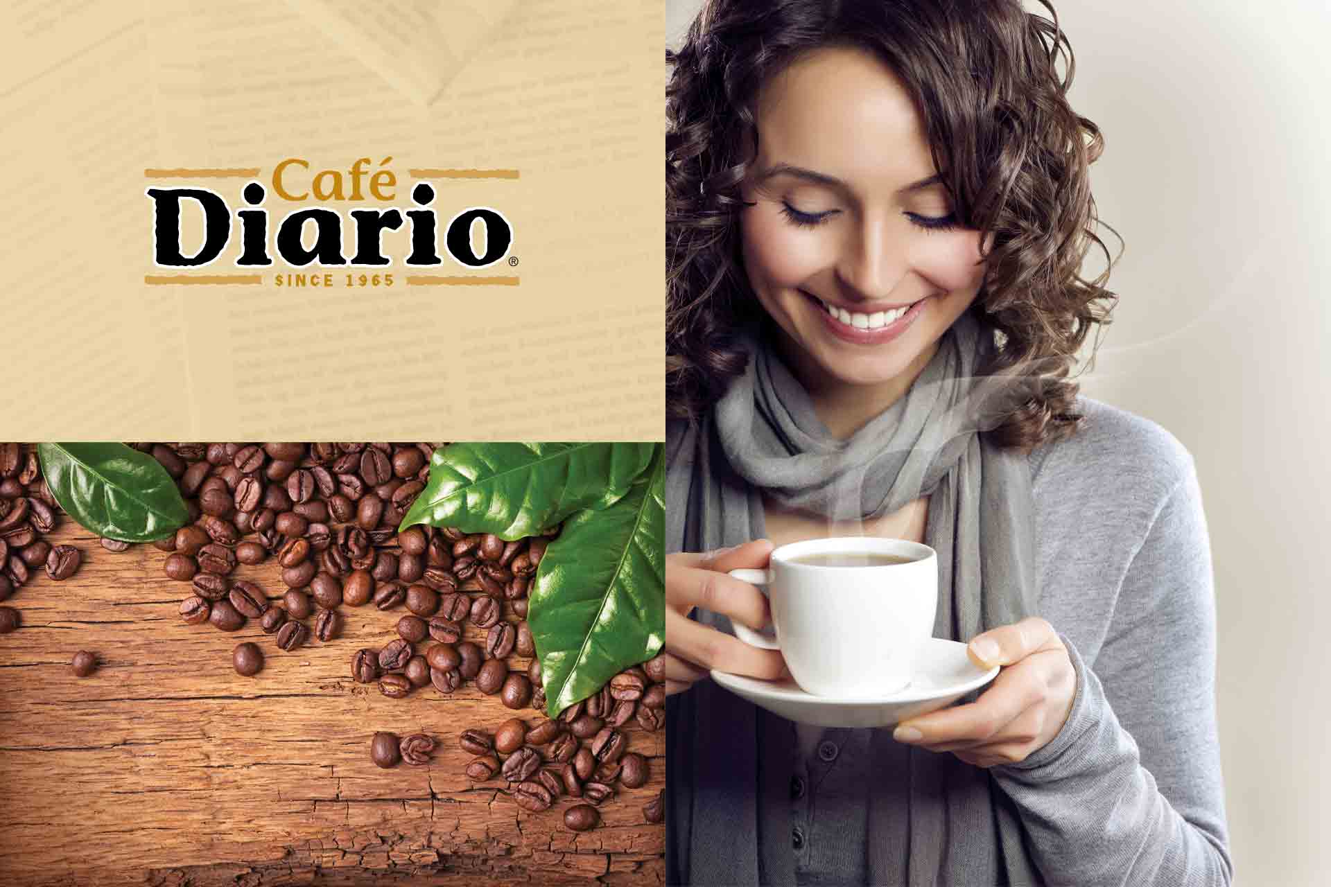
Strategy: Position coffee as a daily ritual accessible to all. Messaging needed to balance origin storytelling with friendly, clear language to welcome novice and seasoned drinkers alike.
Execution: Developed copy and naming conventions that emphasized simplicity, story, and flavor clarity—supporting customer choice and brand trust.
O — Optimization
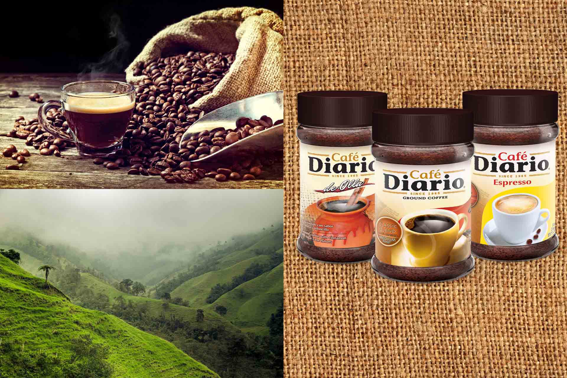
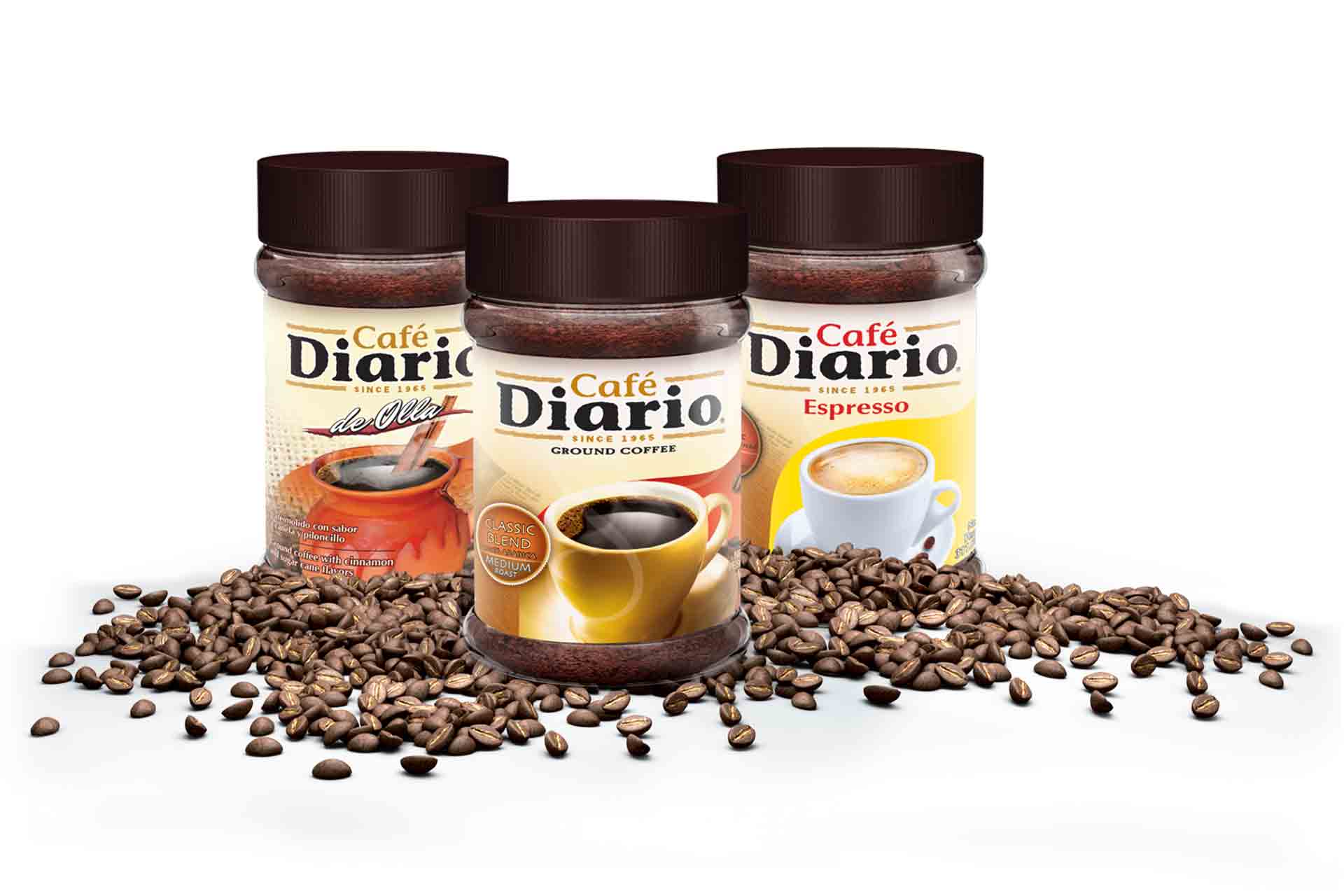
Packaging & Design: Introduced a label system using bold color blocks, minimal yet elegant typography, and subtle illustrations to reflect origin stories and blend notes. The visual hierarchy ensures quick product scanning while retaining charm.
Assets Delivered: Front/back packaging designs, illustrations, brand iconography, and shelf mockups.
N — Navigation
- Improved Shelf Impact: Increased visual distinction led to stronger brand recall and more retail interest.
- Social Media Buzz: Customers shared packaging on Instagram, praising its look and clarity.
- Sales Boost: Cafe Diario reported increased sell-through within the first quarter of relaunch.
This case study shows how branding grounded in strategy, clarity, and creativity can reinvigorate perception and performance—even in saturated categories.